Week 13
Jessica Ngu Wei King (0323639)
Publishing design II: Mass Communication
Final submissions and reflections
Exercise brief
Project one brief
Project two brief
Project three brief
SUBMISSIONS
Exercises
1. Book size mock-up
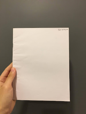 |
| Fig. 1: 16.5 x 21 cm |
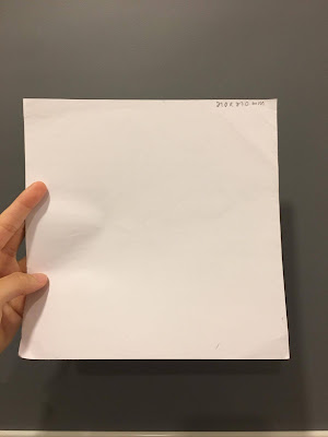 |
| Fig. 2: 210 x 210 cm |
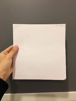 |
| Fig 3: 210 x 200 cm |
2. Van Der Graaf
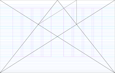 |
| Fig. 4: Van Der Graaf grids created on InDesign |
3. Signature folding
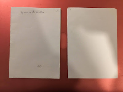 |
| Fig. 5: Signature folding folded-up |
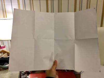 |
| Fig. 6: Signature folding open up |
4. Guessing/ Analyzing layouts
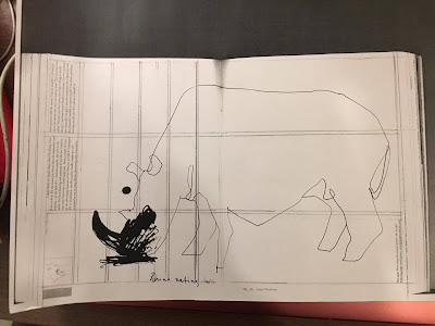 |
| Fig. 7: Photocopied spreads to analyze the layouts |
5. Stitch binding
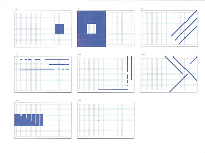
6. Form and movement exercise
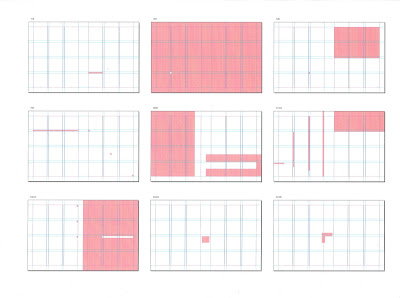 |
| Fig. 8: Exercise 1, one color |
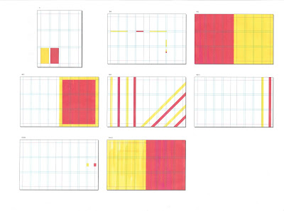
 |
| Fig. 9: Exercise 2, one color |
 |
| Fig. 10: Exercise 3, two colors |
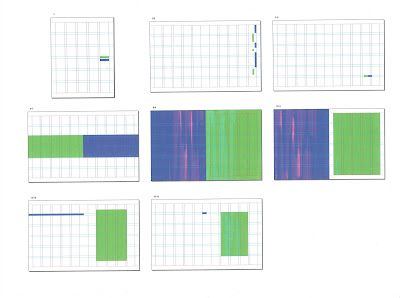 |
| Fig. 11: Exercise 4, two colors |
Project one
Part 1: Generating 3,000 words contents
Part 2: 16 illustrations/ visuals thumbnails
Project 2
Black and white mock-up
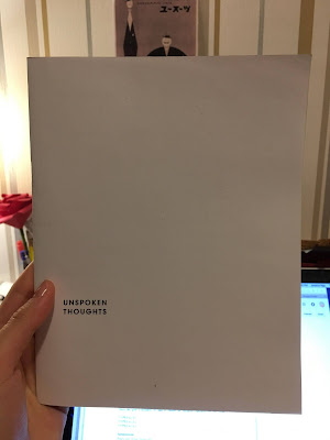 |
| Fig. 12: Black and white mock-up cover |
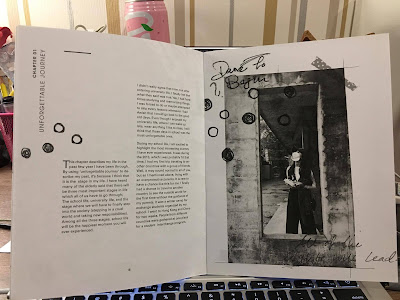 |
| Fig. 13: Black and white mock-up spread |
Full color mock-up
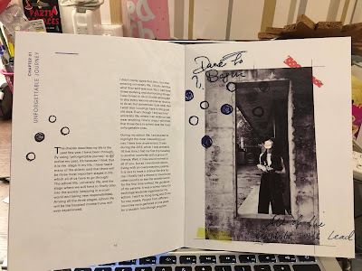 |
Fig. 14: Full color mock-up spread
|
Final hard copy
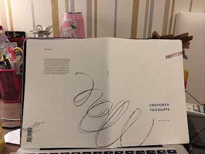 |
| Fig. 15: Final hard copy cover spread |
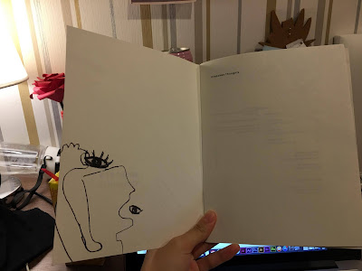 |
| Fig. 16: Final hard copy inside back spread |
12 selected spreads and thumbnails
 |
| Fig. 17 |
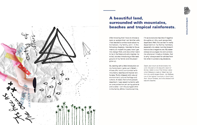 |
| Fig. 18 |
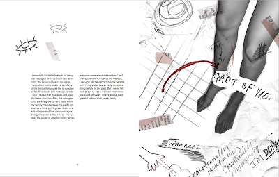 |
| Fig. 19 |
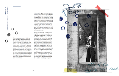 |
| Fig. 20 |
 |
| Fig. 21 |
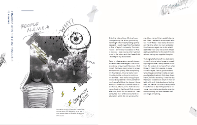 |
| Fig. 22 |
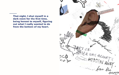 |
| Fig. 23 |
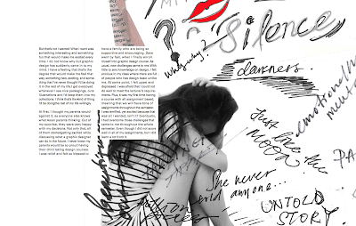 |
| Fig. 24 |
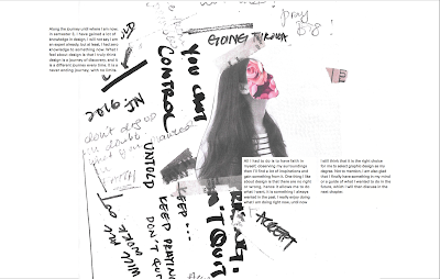 |
| Fig. 25 |
 |
| Fig. 26 |
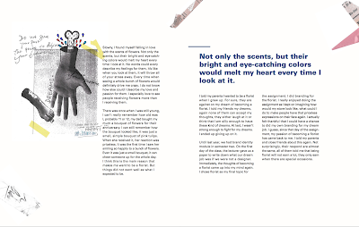 |
| Fig. 27 |
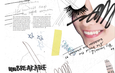 |
| Fig. 28 |
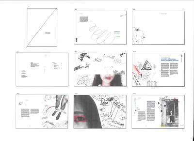 |
| Fig. 29: Layout thumbnails 1 |
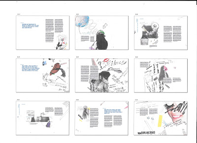 |
| Fig. 30: Layout thumbnails 2 |
Project three: Final project
Desktop thumbnails
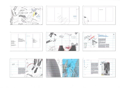 |
| Fig. 31: Desktop thumbnail 1 |
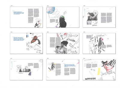 |
| Fig. 32: Desktop thumbnail 2 |
Ipad thumbnails
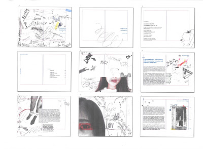 |
| Fig. 33: Ipad thumbnail 1 |
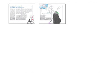 |
| Fig. 34: Ipad thumbnail 2 |
Iphone thumbnails
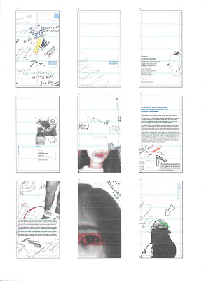 |
| Fig. 35: Iphone thumbnail 1 |
 |
| Fig. 36: Iphone thumbnail 2 |
Final reflections
We finally reached the end of this semester for this module. Personally, I think the workload for this module is still okay for me except for the first few weeks. During the last tutorial session, which is the submission day, Mr.Vinod wanted us to list down our strengths and weaknesses that we think we have based on this assignment. To be honest, I wasn't too sure about the strengths and weaknesses that I have. I think I am able to create strong layouts for my printed book, also I can see myself exploring a lot for my visuals. For the weaknesses, I always struggle when choosing a suitable typeface and also I often overlooked to the small typographic details (which I'm trying to improve myself on this as it might affect the whole look/ feel of the layouts). Comparing to Publishing 1, I think Publishing 2 is not that interesting and fun because we only work on the same project, and looking at the same thing for the whole semester, while we get to do different projects (magazines, books, posters) in the previous semester. However, I gained a lot of technical skills and paying more attention in this semester. Looking through the rough sketches of my visuals, I can see that I explore quite well for my 16 visuals and I'm really satisfied with the outcomes. It's my first attempt for this kind of artwork, so I get quite excited while achieving the outcomes. I find out that I can't judge on what makes a good work and what makes the bad ones. I also noticed that in this semester we rarely had the chance to see through each others works. In my opinion, I think that maybe we could have few sharing sessions (even though its quite difficult/ time consuming) to share our works with the classmates and get feedback from each other to improve our works, as I can't really judge on my own work. Anyway, I quite enjoy this module even though sometimes it gets bored working on the same project. I also find myself started to observe the little typographic details in other people's books or publications, which I think by doing this eventually I'll improve myself and be a better designer.


No comments:
Post a Comment