Week 1 - Week 4
Jessica Ngu Wei King (0323639)
Publishing design II: Mass Communication
Exercises
Instructions
Exercises Individual Work (20%) The Brief
Exercises
Duration of Assignment
8 Weeks (Briefing on Week 1)
DEADLINE
Week 9 (22 May 2017)
Description
Throughout the beginning and the middle of the semester, exercises will be prescribed at various phases of the module. These exercises will aid and benefit you in your quest to gain theoretical and practical knowledge in book design that will inform you whilst completing various phases of the modules projects.
All exercises prescribed are to be completed and documented (labelled, clean, clear & concise) in your ePortfolio and Hardcopy portfolio respectively.
The exercises are as follows:
1) Text formatting
2) Mock-up making
3) Signature folding systems (8+8=16)
4) Classical Grid structure
5) Form & Movement Exercises (Thumbnail) • 1 Colour
• 2 Colour
• 2 Colours + Image
• Colour + Image + Text
Requirements
To complete and to showcase mastery in the exercises prescribed in its various forms over the 13-week period. This process is repeated for all 8 weeks. The work is compiled logically and chronologically in an A3 clear sheet folder and documented on the students’ eportfolio.
Submission
1. Exercises to be documented in an A4 Clear Sheet folder, logically and chronologically. The works must be labelled and dated.
2. Eportfolio posts at the end of the assessment task labelled and dated, with images captured well and in good light in so that the works are pleasing to the eye and legible.
Objectives
1. To develop students theoretical understanding via practical means.
2. To develop students practical skills.
3. To develop students sense in the use of space.
4. To develop students ability to arrange different elements attractively within a grid system.
Submissions
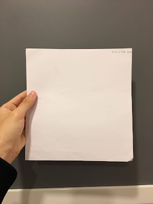
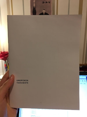
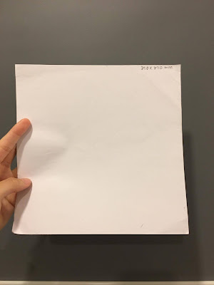
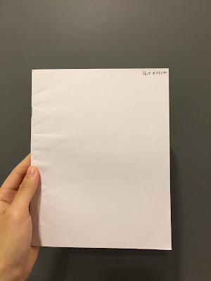
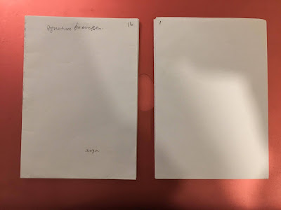
1. We were required to create mockups for our books using A3 papers. We were to determine three different sizes (bigger than A5, smaller than A4), then choose the one we preferred and stapler bind in the middle. The final size I chose was 165mm x 210mm.
 |
| Fig.1 210 x 210 mm |
 |
| Fig.2 210 x 200 mm |
 |
| Fig.3 165 x 210 mm |
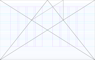
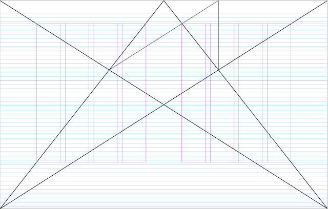
2. For the second exercise, we were instructed on creating Van der Graaf grids. First we made it manually by drawing it on A3 paper, then we proceed to InDesign to made the same thing.
 |
| Fig.4 Van der Graaf grids in InDesign |
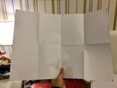
3. We learned to create signature folding systems.
 |
| Fig.5 |
 |
| Fig.6 |
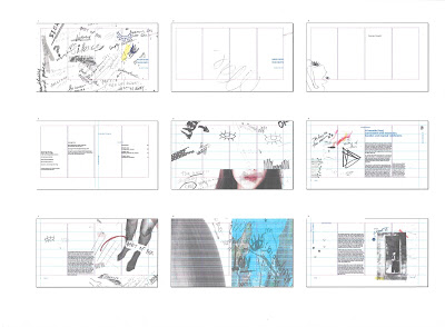
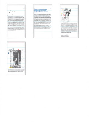
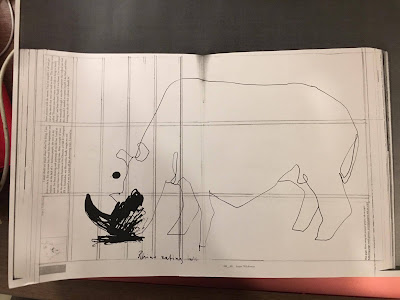
4. For this exercise, we were required to go to the library and look for book layouts that we felt interesting and photocopy the spreads. We were then required to examine the spreads that we've chosen, to examine the grid system used for the book, which includes the margin, columns and rows. The purpose of this exercise was to improve our understanding on how grids and layouts worked.
 |
| Fig.7 Photocopied of the spreads and guessing the layouts, grids |
5. We learned about stitch binding for this exercise. We brought all materials that needed and work on it in class together.
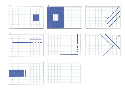
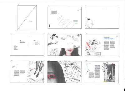
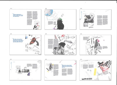
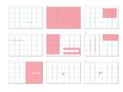
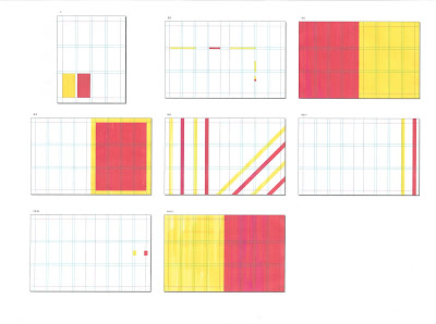
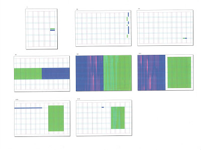
6. This exercise requires us to create a 16 pages of document using the sizes that we've chosen for our book. Using squares/ rectangles, we were to create movement (connections) for each spreads, while all spreads have to have connections throughout the whole book. We were to create two different styles of the same exercise, and another two with two different colors.
 |
| Fig. 8 First attempt, one color |
 |
| Fig. 9 Second attempt, one color |
 |
| Fig. 10 Third attempt with two different colors |
 |
| Fig. 11 Fourth attempt with two different colors |
Reflections
Experience
Wednesday tutorials are the class that I enjoyed the most as we get to explore different kinds of exercises that would help in our assignments. I enjoyed doing the stitch binding as I wanted to do it for so long already, but didn't get to do it. Even though I made some mistakes which I have to redo the steps, but I'm really satisfied with the outcome.
Observation
I find out that I really enjoyed Wednesday tutorials which we get to do these exercises. Also, I find out that the form and movement exercises really helpful for our project two. Besides, I find myself starting to analyzing books/ magazines to see how may column and grids they used to create those layouts.
Findings
For the form and movement exercise, at first, I couldn't really understand what is the whole exercise all about. I have no idea what I'm doing while doing the first attempt, but slowly I understand how it works and it help in future assignments.

